

During the early 20th century, Gestalt theory of perception suggested that people instinctively perceive objects as either figure (the focal point) or backgrounds (the background). Our minds naturally decide which object is the figure, based upon the size of the objects, and which object is the ground based on the larger object's size. The key to creating an optical illusion is to slightly alter the appearance of elements and break the rules of mathematics.
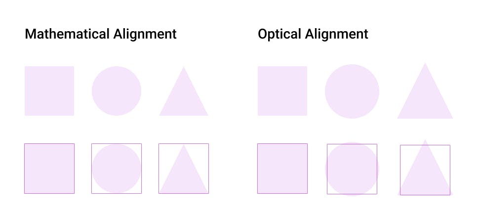
In order to get a clear picture, let's draw a 100x100 pixel square, circle, and triangle. Although mathematically they are all aligned because they all have the same size, if we take a closer look, we will notice that the square appears to be slightly larger than the circle, and similarly, the circle appears slightly larger than the triangle. This is due to the fact that the square is the largest object on the surface followed by the triangle and circle which makes them seem small even though they are not. All of them are aligned mathematically but not optically.
Here's an example of how both mathematical and optical alignment looks.
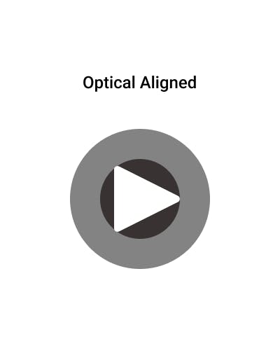
In order to fix this problem, let me show you how it works around the play button. First of all, here's a play button with mathematical alignment.
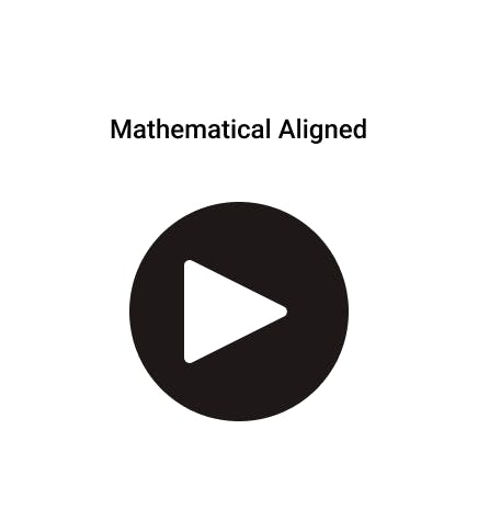
In the example below, we can clearly see that the mathematically aligned play button is centered, but we can also see that something seems to be wrong with it.
Now here is what the play button looks like when aligned optically. The distance to move the shape to achieve visual balance relative to other layers is known as Optical compensation.
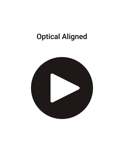
A simple way to align optically is to reduce the outer circle's size so that it occupies only the triangular part of the image.
Here's another example of mathematical and optical alignment
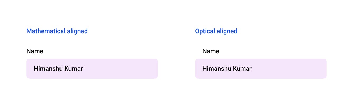
If you look at the first example, it is mathematically aligned to the left, but you may find it to be a bit annoying, while if you look at the optically aligned one, it is perfectly balanced and doesn't create distractions.